
 Sobhan Mohmand, Career Expert
  23 June 2023

One great way of improving the presentation, readability and effectiveness of your CV is to choose an appropriate font for your CV.
The font you select sets the tone for your CV, conveying professionalism, clarity and attention to detail.
There are hundreds of fonts available so which one should you use?
The guide below contains a list of the best CV fonts that you can use to make your CV more visually appealing to the employer and secure a job interview.
Let’s get started!

It’s the best of both worlds; hence it is ranked #1.
Best for: All sectors and industries, including Business, Marketing, Economics, Design, Media, IT, Science and Engineering.

Similar to Lucida Sans, this sans serif font has been designed to be highly legible on screen.
Many governments and major international organisations have adopted it as their chosen display font for their products and services.
There must be something good about it if it is so popular, right?
Best for: Engineering, Transport and Logistics, Hospitality and Catering, Health and Social Care and Information Technology.

Ranked #3 is Arial.
Many CV experts would recommend using Arial as your CV’s font and it is not difficult to see why. Its clean and elegant format makes reading the text easy and effortless. There are no distractions either in the visual presentation of the letters or the spacing between the letters.
This classic typeface does the job excellently!
James Reed, Chairman of one of Britain’s biggest recruitment brands Reed, states in The 7-second CV: How to Land the Interview (pg.36): “Choose a professional font, such as Arial, Verdana, Calibri or Times New Roman, so a recruiter can scan and read your CV easily. These are readable not only by hiring managers but also by Applicant Tracking Systems.”
Best for: Economics, Business, Public Sector, Education and Science.

Without getting into the intricate technicalities of typography, Verdana is known for having a large x-height. This makes the lowercase letters appear tall, bulky and easier to read even in smaller text sizes. Verdana also has wider letters than most fonts.
Various studies and surveys, including those conducted by the Software Usability and Research Laboratory at Wichita State University, found that Verdana was amongst the best fonts for legibility.
Verdana is in many respects similar to Tahoma (see #8 below).
Best for: Marketing, Media, Business and Publishing.
Cambria belongs to the serif family of typefaces, meaning it has a small line attached to the end of each letter. If you look closely, you will see these design touches and decorative markings clearly on the “G” or “L” in the above example.
Serif fonts are widely used in newspapers, magazines and books whereas sans serif fonts are cleaner, more modern-looking and designed to improve readability on screens.
Unlike Times New Roman, the most famous serif font, Cambria has been designed for screen readability despite it being from the serif typeface family.
Best for: Legal Services, Economics and Business.

Georgia, another popular serif typeface font, is widely adopted on signposts, advertising boards and websites. It has an elegant look, while still being easy to read both on the digital screen and on paper.
This font closely resembles the Times New Roman typeface (see #9 below) but its unusually large x-height and bold weight are comparable to Verdana.
One recruiter stated: “Popular typefaces that you can use on your CV include Arial, Helvetica, Georgia, Times New Roman and Verdana. They are professional, easy to read and get results.”
Best for: Public sector, Science, Economics and Legal Services.
Calibri is favoured by many applicants for its simplicity, elegance and warmness. The letters are sleek, with slight curves, making them more legible and appear polished when printed on paper or viewed on a screen. A good indication of its popularity is that Calibri is currently Microsoft Word’s default font.
Best for: Students and young professionals applying for entry-level jobs.
Tahoma has a bulky look and feel to it similar to Verdana. This has the advantage of being easily readable through a variety of different mediums.
As can be seen from the above example, however, the Tahoma typeface has much tighter letter spacing and a narrower text body. This can make the text look cramped and restricted if you’re using a small font size!
Best for: Marketing, Design, Engineering, Education and IT.
Garamond is another elegant and professional font that gives an impression of maturity and would be a suitable candidate for your CV.
It is of the serif typeface family, with some resemblance to Calibri due to its letter spacing and having a light feel to it.
Best for: Business, Politics and Education.
Times New Roman is probably the most controversial font that you can use on your CV. It has divided expert opinion for years.
Times New Roman is an old-fashioned font based on printing typeface which was originally used in The Times newspaper before the Second World War. It’s not considered to be the most readable font.
According to most experts, there is nothing wrong with the font itself per se.
The main problem with it is the fact that it is so widely used for CVs that if you select this font your CV it will not stand out from the other CVs.
They will all look and feel the same!
Best for: Law, IT, civil service and Business.
There are certain fonts that are not recommended due to their illegibility, unprofessional appearance, or lack of widespread compatibility. Here are a few examples of fonts that are generally considered poor choices for CVs:
The sole purpose of your CV is to convey information about you to the employer. Anything that hampers this objective will negatively impact your chances of being invited for a job interview.
CVs with fancy, distracting, unprofessional or difficult-to-read fonts are automatically rejected!
Consider the following example of a typeface that is difficult to read:
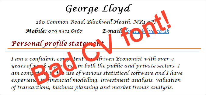
No recruiter will ever read it!
Recruitment managers are busy people and they do not have the time to sit down and decipher or interpret your CV. You have to get their attention right away as recruiters spend less than 30 seconds looking through your CV.
Any font you choose has to be legible, professional and mainstream (widely supported).
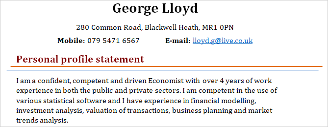
The font size of a text determines how large its characters will be displayed on a screen or printed on paper, measured in points (pt). The standard font size for displaying regular text on websites, books and magazines is between 10 and 14 pt.
For your CV, use a font size of 10-12 points for the main text with larger sizes for subheadings and headings.
Simon Howard states in Creating a Successful CV (pg. 34-35): “Avoid making the main text too small. Using too large a point size will waste valuable space, too small and the text can appear dense and difficult to read. As a guide, use 10-12 points for the body text and nothing over 16 points for headings.”
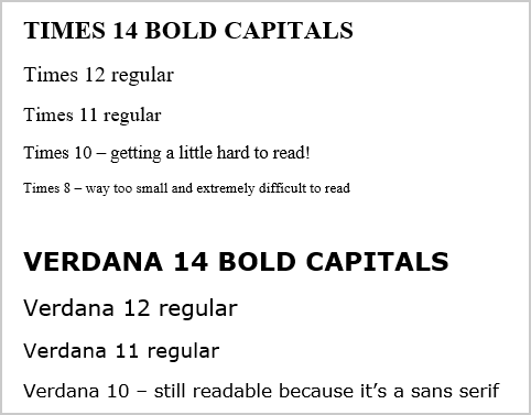
As can be seen from the example above, a given font size that is appropriate for one typeface may be too big or too small for another. It is recommended that you experiment with different font sizes to see which size is appropriate for your CV, taking into account legibility and formatting issues.
TIP: If you struggle to put all your information on 2 pages; consider changing the typeface and font size of your CV as that might free up some valuable space.
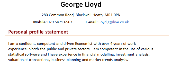
As previously stated, you should choose one typeface for your CV and use it for the whole document. However, there is a small exception to this rule when it comes to headings; it is OK to use one typeface for the main body text of your CV and another for the headings.
In most cases, this will improve the presentation of your CV by nicely dividing the main content and the headings into two distinguishable parts.
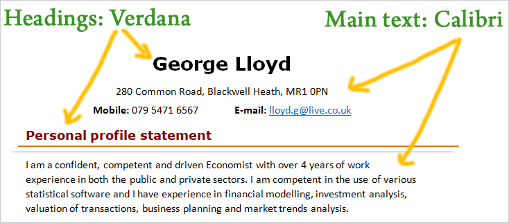
Tip: Experts recommend using Verdana or Tahoma to create impactful CV headings as they tend to make the text stand out from the main content.
Most people know how to change the font of their CV.
For those that don’t, use the steps below to change the font of your document in Microsoft Word and most other word processing applications:
Step 1: Highlight all the text of your CV (or press Ctrl + A on your keyboard)
Step 2: Navigate to the “Fonts” option in the user interface:
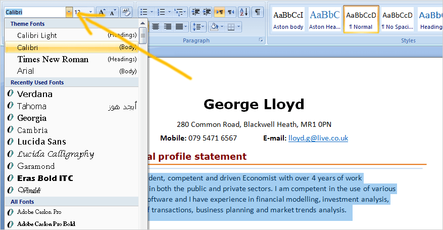
Step 3: Select a font from the dropdown menu and click on it.
Done!
Using a professional font for your CV can make it aesthetically pleasing and effortless to scan, skim and read. It will encourage the employer to keep reading your CV and improve your chances of being invited for an interview.
When it comes to choosing a font for a CV, it’s recommended to opt for a clean, professional and easily readable font. Popular fonts that meet these criteria include Arial, Calibri, Helvetica, Verdana, Lucida Sans and Tahoma.
As most CVs are read on screens rather than on paper nowadays, sans serif fonts are the preferred choice for your CV; they are cleaner and more modern-looking.
The best CV font, based on our analysis, is Lucida Sans. It has an elegant, modern and professional appearance, it is easy to read on screen and when printed, and it is widely supported by various computer applications programs.
Remember that font choice is just one aspect of your CV’s overall appearance. It’s also essential to consider related factors such as font size, spacing, and overall formatting to ensure your CV is well-organised and easy to read.
Good luck with your job hunt!
 Sponsored